If you want to improve the Animated Menu in WordPress, then this post is for you. The best and most effective clean, smooth, and premium menu animations are available on pure CSS, and just a tiny bit are on JavaScript.
Table of Contents
These animations actually make the site advanced and easy to navigation. They also make it modern, user-friendly, and more professional. Our WordPress website remains active and performs optimally.
In this complete guide to Animated Menu in WordPress, we will guide our readers and users regarding the 12+ high-quality menu animation styles. They include –
- Premium gradient underline
- Highlight/glass background
- Glow effect
- Slide & lift animation
- Stagger delay animation
- Animated dropdowns
- Ripple click effect
- Mobile hamburger animation (CSS + JS)
- Previously listed styles (fade, border reveal, colour-fill, etc.
All code works on:
- Astra
- GeneratePress
- Block Themes
- Classic themes
- Any theme with
.main-navigationor equivalent menu class
Just copy and then paste. Then refresh it and press the done tab.
Why Animated Menus Improve UX
Animated menus do more than “look good.” They:
- It visually guides visitors.
- Improve click clarity
- It can create a refined, superior appearance
- Motivates users for longer duration usage.
- Increase mobile usability
- Working with pure CSS, users don’t worry about the performance
Since these animations run on the GPU (transform, opacity, scale), they are smooth even on low-powered devices.
Before You Begin Animated Menu in WordPress
Most themes use a container like:
<nav class="main-navigation">
  <ul>
    <li><a href="#">Home</a></li>
    <li><a href="#">Services</a></li>
    <li><a href="#">Blog</a></li>
  </ul>
</nav>
If your theme uses:
.primary-menu.header-nav.main-header-menu
Just replace .main-navigation a with your menu link selector.
SECTION 1: Premium Animated Menu Styles
We have shared here all the premium animations and those previously given ones. We have combined them in one guide.
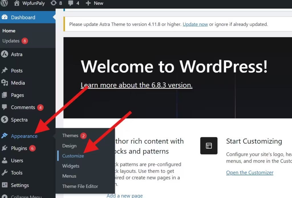
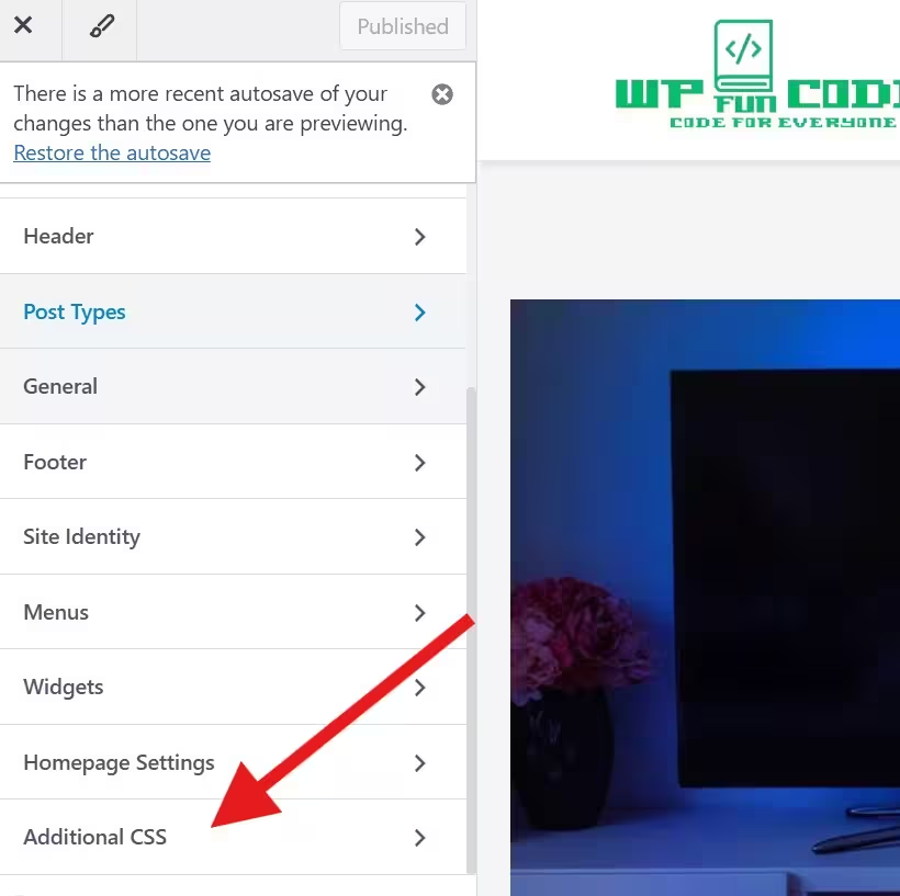
Just go and paste the given code in the WordPress Dashboard. Then go to the Appearance and then to the Customise option, and after that, to the Additional CSS.
1. Gradient Underline Animated Menu in WordPress
A smooth premium gradient slides in on hover.
.main-navigation a {
  position: relative;
  padding: 6px 4px;
  transition: color .25s ease;
}

.main-navigation a::after {
  content: "";
  position: absolute;
  left: 0;
  bottom: -6px;
  height: 3px;
  width: 0%;
  border-radius: 6px;
  background: linear-gradient(90deg,#00c6ff,#0072ff,#8a2be2);
  transition: width .35s cubic-bezier(.2,.8,.2,1);
}

.main-navigation a:hover::after,
.main-navigation a:focus::after {
  width: 100%;
}
2. Stagger Underline Animation (Menu-by-Menu Delay)
Looks like each item animates with a delayed beat.
.main-navigation a {
  position: relative;
}

.main-navigation a::after {
  content: "";
  position: absolute;
  left: 50%;
  bottom: -6px;
  width: 0;
  height: 2px;
  background: #1e73be;
  transform: translateX(-50%);
  transition: width .38s cubic-bezier(.22,.9,.3,1);
}

.main-navigation a:hover::after {
  width: 100%;
}

.main-navigation li:nth-child(1) a { transition-delay: .02s; }
.main-navigation li:nth-child(2) a { transition-delay: .04s; }
.main-navigation li:nth-child(3) a { transition-delay: .06s; }
3. Glass Highlight Background (Frosted Blur)
.main-navigation a {
  position: relative;
  padding: 10px 14px;
  border-radius: 999px;
}

.main-navigation a::before {
  content: "";
  position: absolute;
  left: 0;
  top: 50%;
  width: 0%;
  height: 60%;
  background: rgba(255,255,255,0.08);
  backdrop-filter: blur(6px);
  transform: translateY(-50%);
  border-radius: 999px;
  transition: width .35s ease;
}

.main-navigation a:hover::before {
  width: 110%;
}
4. Color Fill Animation (Smooth Expansion)
.main-navigation a {
  position: relative;
  padding: 8px 14px;
  transition: color .3s ease;
}

.main-navigation a::before {
  content: "";
  position: absolute;
  inset: 0;
  background: #1e73be;
  transform: scaleX(0);
  transform-origin: left;
  transition: transform .3s;
  z-index: -1;
}

.main-navigation a:hover::before {
  transform: scaleX(1);
}

.main-navigation a:hover {
  color: #fff;
}
5. Hover Glow Animation (Premium Neon)
.main-navigation a {
  transition: .3s ease;
}

.main-navigation a:hover {
  color: #1e73be;
  text-shadow: 0 0 8px rgba(30,115,190,0.8);
}
You may Also Need This
Back To Top Button In WordPress : https://withoutplugin.com/back-to-top-button-in-wordpress/
6. Smooth Fade + Lift Animation
.main-navigation a {
  display: inline-block;
  transition: .25s ease;
}

.main-navigation a:hover {
  transform: translateY(-3px);
  opacity: .8;
}
7. Icon Indicator Slide
.main-navigation a {
  position: relative;
  padding-left: 18px;
}

.main-navigation a::before {
  content: "";
  position: absolute;
  left: 0;
  top: 50%;
  width: 8px;
  height: 8px;
  background: #ff6b6b;
  border-radius: 2px;
  transform: translate(-6px,-50%);
  opacity: 0;
  transition: transform .28s, opacity .2s;
}

.main-navigation a:hover::before {
  transform: translate(0,-50%);
  opacity: 1;
}
8. Border Reveal Animation
.main-navigation a {
  position: relative;
  padding: 8px 14px;
}

.main-navigation a::before,
.main-navigation a::after {
  content: "";
  position: absolute;
  border: 2px solid #1e73be;
  width: 0;
  height: 0;
  transition: .3s;
}

.main-navigation a::before {
  left: 0;
  top: 0;
}

.main-navigation a::after {
  right: 0;
  bottom: 0;
}

.main-navigation a:hover::before,
.main-navigation a:hover::after {
  width: 100%;
  height: 100%;
}
9. Slide Dropdown Animation
.main-navigation ul ul {
  opacity: 0;
  transform: translateY(10px);
  pointer-events: none;
  transition: .25s ease;
}

.main-navigation li:hover > ul {
  opacity: 1;
  transform: translateY(0);
  pointer-events: auto;
}
10. Ripple Click Animation (JS + CSS)
CSS:
.menu-ripple {
  position: absolute;
  border-radius: 50%;
  transform: scale(0);
  opacity: .5;
  background: rgba(30,115,190,.18);
  animation: ripple .6s linear;
}

@keyframes ripple {
  to { transform: scale(6); opacity: 0; }
}
JS:
<script>
document.addEventListener('click', function(e){
  var a = e.target.closest('.main-navigation a');
  if(!a) return;
  var rect = a.getBoundingClientRect();
  var ripple = document.createElement('span');
  ripple.className = 'menu-ripple';
  var size = Math.max(rect.width, rect.height);
  ripple.style.width = ripple.style.height = size + 'px';
  ripple.style.left = (e.clientX - rect.left - size/2) + 'px';
  ripple.style.top = (e.clientY - rect.top - size/2) + 'px';
  a.appendChild(ripple);
  setTimeout(()=> ripple.remove(), 700);
});
</script>
11. Animated Mobile Hamburger Menu (CSS + JS)
(You already have this in detail — included in full post)
12. Underline Slide Animated Menu in WordPress (given earlier)
.main-navigation a {
  position: relative;
}

.main-navigation a::after {
  content: "";
  position: absolute;
  left: 0;
  bottom: -4px;
  width: 100%;
  height: 2px;
  background: #1e73be;
  transform: translateX(-100%);
  transition: .3s ease;
}

.main-navigation a:hover::after {
  transform: translateX(0);
}
How to Add These Styles Cleanly (functions.php Method)
You can output CSS + JS without editing theme files:
function wop_custom_menu_styles() {
    wp_add_inline_style('wp-block-library', '/* paste CSS here */');
}
add_action('wp_enqueue_scripts', 'wop_custom_menu_styles');

function wop_custom_menu_scripts() {
    wp_add_inline_script('jquery-core', '/* paste JS here */');
}
add_action('wp_enqueue_scripts', 'wop_custom_menu_scripts');
This keeps everything up-to-date.
Performance & Accessibility Tips
- Prefer
transform,opacity,scale(GPU-accelerated). - Add
:focusstyles for keyboard navigation. - Use
prefers-reduced-motionfor accessibility:
@media (prefers-reduced-motion: reduce) {
  * { transition: none !important; animation: none !important; }
}
Conclusion
This post highlights that you don’t require any plugins for premium menu animations in WordPress.
With the right combination of CSS and small JavaScript snippets, users can create, design, and navigate new, more powerful menus. These are the latest, trendy, advanced, smooth, and highly interactive.
The best part is that these snippets make the site animation part lightweight, user-friendly, and compatible with every theme. You can easily use Astra, GeneratePress, or a block-based theme.
Kindly share your suggestions and queries. We value our readers. We respind to all comments.
Thank You.